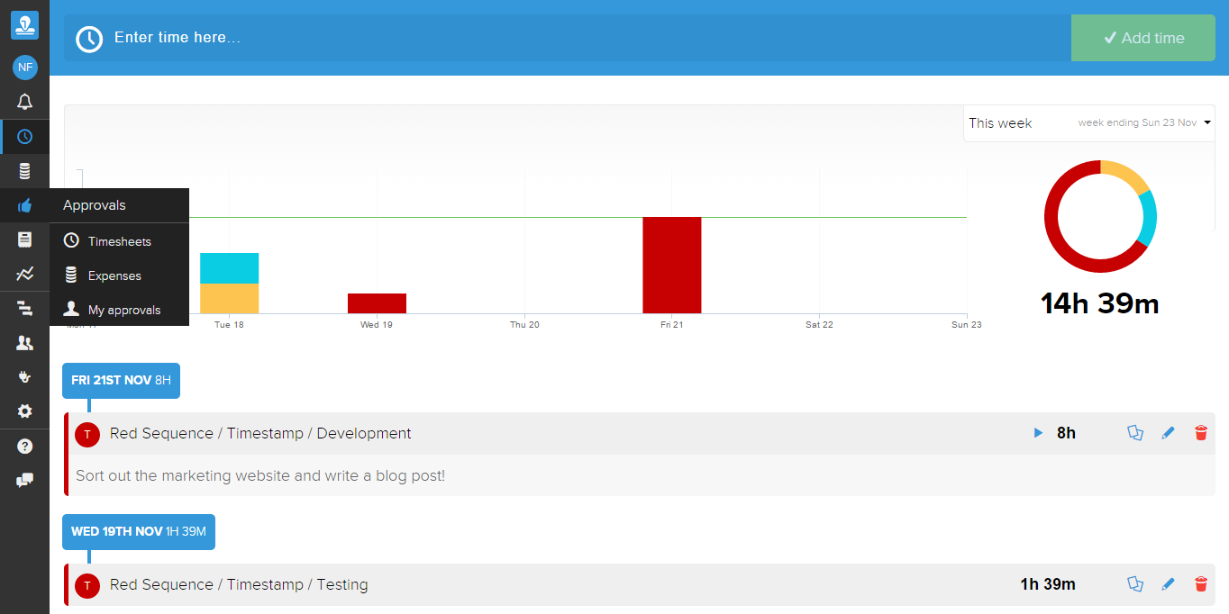
Something that we've had backlogged for a while is sorting out the desktop monitor real estate issue - we just weren't taking full advantage of larger monitors. Dashboard screens often necessitate full-screen to achieve the best effect, and indeed this is why project dashboards was the first component to take advantage of larger screen sizes. We quickly realised that this made the rest of the app look a bit out of date, and decided it was the right time to fix it before ploughing on!
Why we've done this...
- Faster and more compact navigation
- Nicer and more standardised tabs controls
- More space to display the information you need to make business decisions about, especially tables and dashboards!
- It will eventually help us with new features we have in the pipeline (e.g. Calendar view for Timesheets)
Mobile
We took the opportunity to clean-up and standardise the mobile view and checked compatibility with Android 5.0 Lollipop and iOS 8. For those interested we've been following the Google material design guidelines in a loose way. It's a very clean design language that translates well from mobile devices through to desktop browsers.
Still to do
We want to make the forms and tables better. This should now be easier that everything is standardised.
Where's my stuff?
Don't worry, everything that used to live on the menu bar above is still accessible on the left menu bar, but now includes:
- Contact support
- Help
- Notifications
- Timers now appear at the bottom of the screen, but only when they are running
We're interested in your feedback. Like what you see? Something you do not like? Send us a message by adding your comments below or by contacting support through the app or at info@timestamp.io.
In other news
Work on our Xero add-on is 95% complete - we hope to submit it for review by tomorrow. Work continues on the project dashboards which should now be easier with more space to play with!