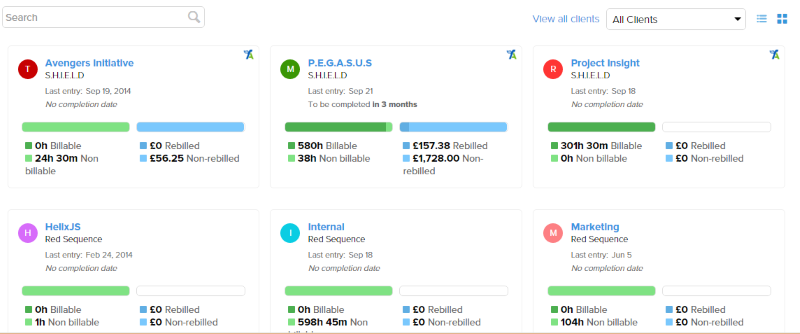
Understanding the state of your projects is vital to maintaining a healthy business, so we've made it a little easier by introducing a new grid layout for your projects.
With the new view you can see the usual project items at a glance:
- Project and client name
- Where the project originated from - third-party add-on or Timestamp
- The time of the last activity on the project
- The completion date, if one exists
- Quick glance overview of timesheet and expense statuses
However, we believe that the core benefit of the grid design is it's compactness and information density, enabling easy comparison of one project to another. As an added bonus it also lends itself nicely to mobile devices.
If for some reason you prefer the old list design then simply switch back by pressing the relevant button.
We're interested in your feedback about this tweak, as we have plans to roll it out to other areas of the system such as Users, Clients and Tasks.
Up next - a number of user (resource) improvements and new reports, and a new add-on hub and set-up experience.
